“On the Third Day of Planning, your boss will ask of you:
THREE Design Directives . . .
(Two Website Questions . . . and One Measurable Marketing Plan.)”
-
Are you using “above the fold” on each page of your website wisely?
It’s probably time to review your website page-by-page as you plan for the coming year. Each page of your website has “high priority elements” that should appear as high up on the page as possible. But you know what happens . . . as changes are made to websites over time, some of those “high priority elements” may have dropped down on the page, become smaller, or been made less prominent (especially common on your Home page).
For each individual website page, list IN PRIORITY ORDER the items that need to be on the page. What should be your highest priority items? They likely include:
- Specific Benefit Headline: Does your headline give the visitor a compelling reason to stay on that page and learn more? The more specific the headline, the better. (Hint: “Products” and “Solutions” are not compelling headlines.)
- Key Action Items or Offers: if you’re generating leads, it’s the action button that signs me up for your webinar, downloads the white paper, or gives me access to the case study. If you’re an e-commerce website, it’s the “Add to Cart” button.
- Key Visual that Helps the Sell: the video of your product in action, or the photo of the product in use. Note “helps the sell” means either a visual that needs to be there for the product to be sold, or a visual that may enhance the probability of the sale. Visuals that aren’t critical to the sell (stock photos, etc.) do not need to distract your visitor “above the fold.”
Visitors to your website may have multiple windows open within their browser, making the “above the fold” area even smaller. Be sure EVERY visitor sees your most important elements high on each page, to give you the best chance of drawing in every visitor to the page and getting the response.
-
Does the layout move the eye to the most important elements?
When a web page is opened, the eye typically is drawn first to any photo containing people (and secondly, to any other photo). Placement of visuals throughout the page can also draw the eye to that section of the page.
Open each page of your website, to see what draws your eye. Is that where you want the visitor’s eye to go? Where is your eye drawn as you move down the page?
Are there important elements on the page that your eye doesn’t notice? Review the list of items in priority order that you developed above; be sure that the layout of each page emphasizes the most important items and messages, and draws the eye down the page.
-
Does the page look easy to get through?
Do you see a prominent headline that presents specific benefits to the visitor? How about a series of subheads that outline the key points in the text? Use of bullet points and numbered points? Short paragraphs? These elements can make a page look “friendlier” to the visitor.
Note: specific headlines and subheads can also be better for SEO, as they’re likely to include keyword phrases.
As you review your website and plan its enhancements, notice pages with long paragraphs, or pages with no subheads. Remember the majority of visitors will scan your page first. So:
- Write specific subheads so the scanning reader doesn’t miss your important points.
- Break up long paragraphs: use bullets or numbered points.
- Use pull quotes or put a box around some elements. No visitor welcomes a long page of long paragraphs.
Did you miss: “On the First Day of Digital Marketing Planning . . . One Measurable Marketing Plan?”
Or: “On the Second Day of Planning . . .Two Website Questions . . .”
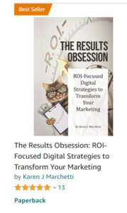
Excerpted from our new BEST-SELLING book, “The Results Obsession: ROI-Focused Digital Strategies to Transform Your Marketing,” now available on Amazon!

Learn more about The Results Obsession and see the Table of Contents
The book includes a chapter on website navigation, a separate chapter on building Buyer Personas, and chapters on website content, website copy, and SEO.


Leave A Comment