Copy on your website has a visual component that affects its ability to get read. And it’s the job of the copywriter to create copy that draws the reader in, not only by the words, by also visually.
When you write or review copy, here are the visual elements of copy to consider:
Key points just by scanning
Your copy should be easily scannable – because 71% – 85% (or more) of your audience will scan copy first.
Multiple studies confirm that people view web pages in exactly the same way they review email, direct mail, and print ads. People scan, rather than read line-by-line, word-for-word.
“Scannable” means ensuring your audience doesn’t miss your key points by putting them in:
- Headlines and subheads
- Captions, bullet points, and bolds
When your make your copy scannable, you’re essentially creating an “outline” of your key messages.
Scannable copy looks easier to get through. It helps your audience find the information they’re looking for. And they quickly see the key benefits of your product or service.
You should be able to read just the headlines and subheads and get all the key points of your message:
- What’s in it for me? (the benefits)
- Why should I buy yours? (over the competition)
- What do I have to do to get it? (next step)
- Why should I do it now? (your Offer)
A website we wrote targeted those concerned about preventing heart disease. If you read the headline and subheads, you get the entire story:
“Heart disease will claim 500,000 lives this year – but you can reduce your risk by 30% to 50%”
“Heart disease is diet-related – but it’s virtually impossible to reduce your risk by changing your eating habits alone!”
“Antioxidants in the right amount and right combination can help prevent heart disease”
“To reduce your risk, choose the optimal formula”
“When you order by xx/xx/xx, you’ll get a free . . .”
I think it was Jacob Weisberg who first told us a huge portion of our audience scans – and those who only scan account for 50% – 75% of those who take action!
Looks easy to get through
When visitors arrive on a page of your website (or open your email), you want them to instantly find a reason to stick around.
Don’t present your audience with long paragraphs. Visually break things up. When should you create a new paragraph?
- When the subject changes.
- If things would be clearer.
- When you have a key point you don’t want the scanning reader to miss. There’s nothing wrong with a one-line paragraph, a one-sentence paragraph, or a paragraph with three words ̶ if that gives the emphasis you need. (This isn’t your sixth-grade essay.) We’re seeing more winning emails written with one-sentence paragraphs, because it’s easier to read – and helps keep recipients reading.
- To make it look easy to get through. Lots of long paragraphs look daunting and uninviting. Break things up, so copy looks easy to read.
To sell effectively, you have to answer all of your Buyer Personas’ key questions and address their objections. How do you make all that copy look easy to get through?
1. Use bullet points and numbered lists.
Bullets help emphasize your key points and are easy to scan. Numbered lists get high readership.
2. Use specific subheads.
Make every subhead useful to the reader – by telling the scanning reader what the paragraph or section is about.
3. Re-organize your content into more interesting formats.
Consider checklists, charts, case studies, or Question-and-Answer (like FAQs). Visitors may read an entire page of question-and-answer and not realize they’ve read an entire page of copy. That’s because question-and-answer reads more like a conversation – the way someone would really ask and answer the question.
4. Use on-page tabs (common on ecommerce websites).
Tabs are like subheads. Only the copy under one tab appears at any one time, so it simplifies the page. To see additional copy, just click one of the other tabs.
This is especially useful on a mobile device. You can make the detail available without the visitor having to scroll through all of it.
From an SEO perspective, search engines see the copy in ALL of the tabs as being on the same page. (And Google likes pages with enough quality Content.) So, tabs can help you put enough Content on a page to help with SEO.
In general, many improvements that make a website’s copy more “usable” and friendly to the visitor tend to be good for SEO as well.
So, whenever you write or review copy, be sure it’s also been written to be visually appealing.
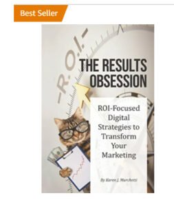
 Excerpted from one of the 5 copywriting chapters in our new BEST SELLER, “The Results Obsession: ROI-Focused Digital Strategies to Transform Your Marketing,” now available on Amazon.
Looking for a shorter read? Check out our ebook, Stop Wasting Your Digital Marketing Budget: Excerpts from The Results Obsession
Learn more about The Results Obsession book, get chapter excerpts to download, and see the Table of Contents.


Leave A Comment